

 Niki Hynes


580 California St., Suite 400
San Francisco, CA, 94104
19 citations
2009, Journal of Brand Management
https://doi.org/10.1057/BM.2008.5…
11 pages

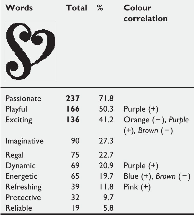
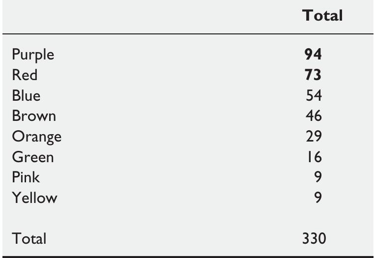
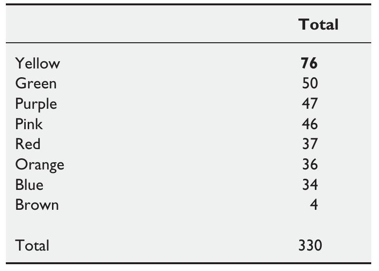
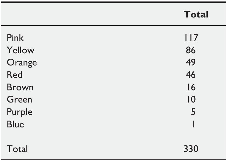
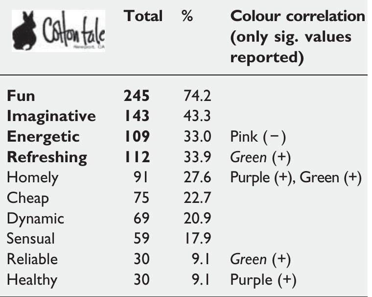
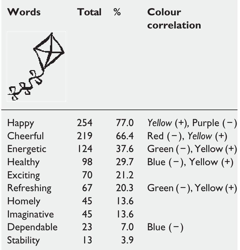
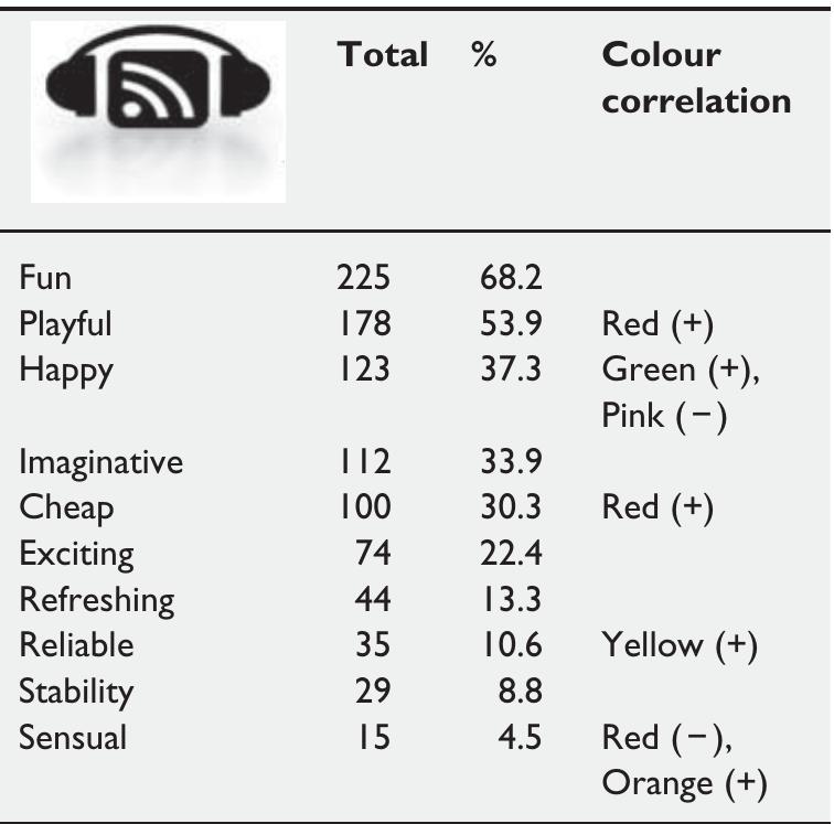
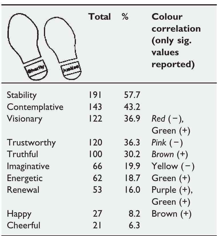
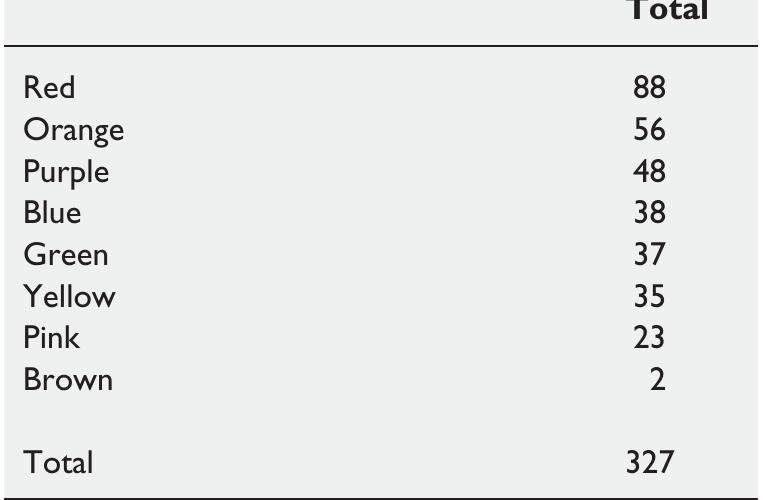
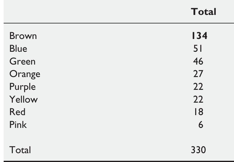
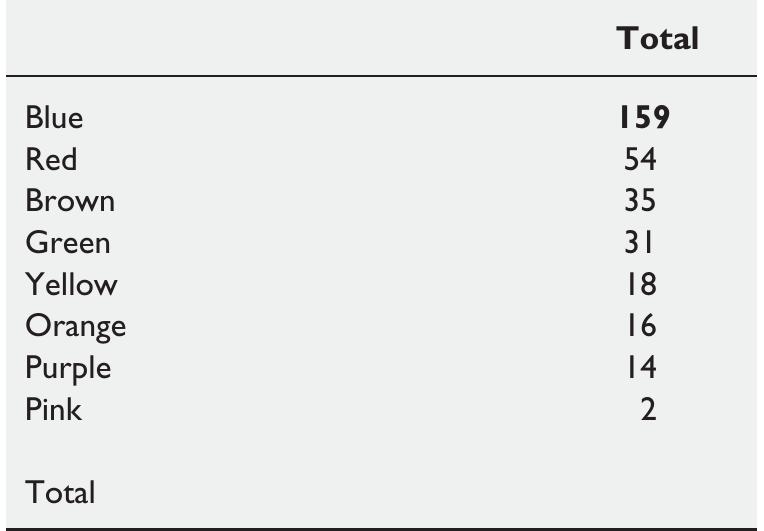
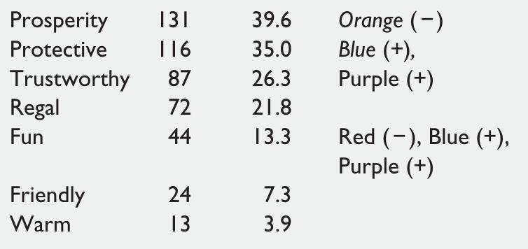
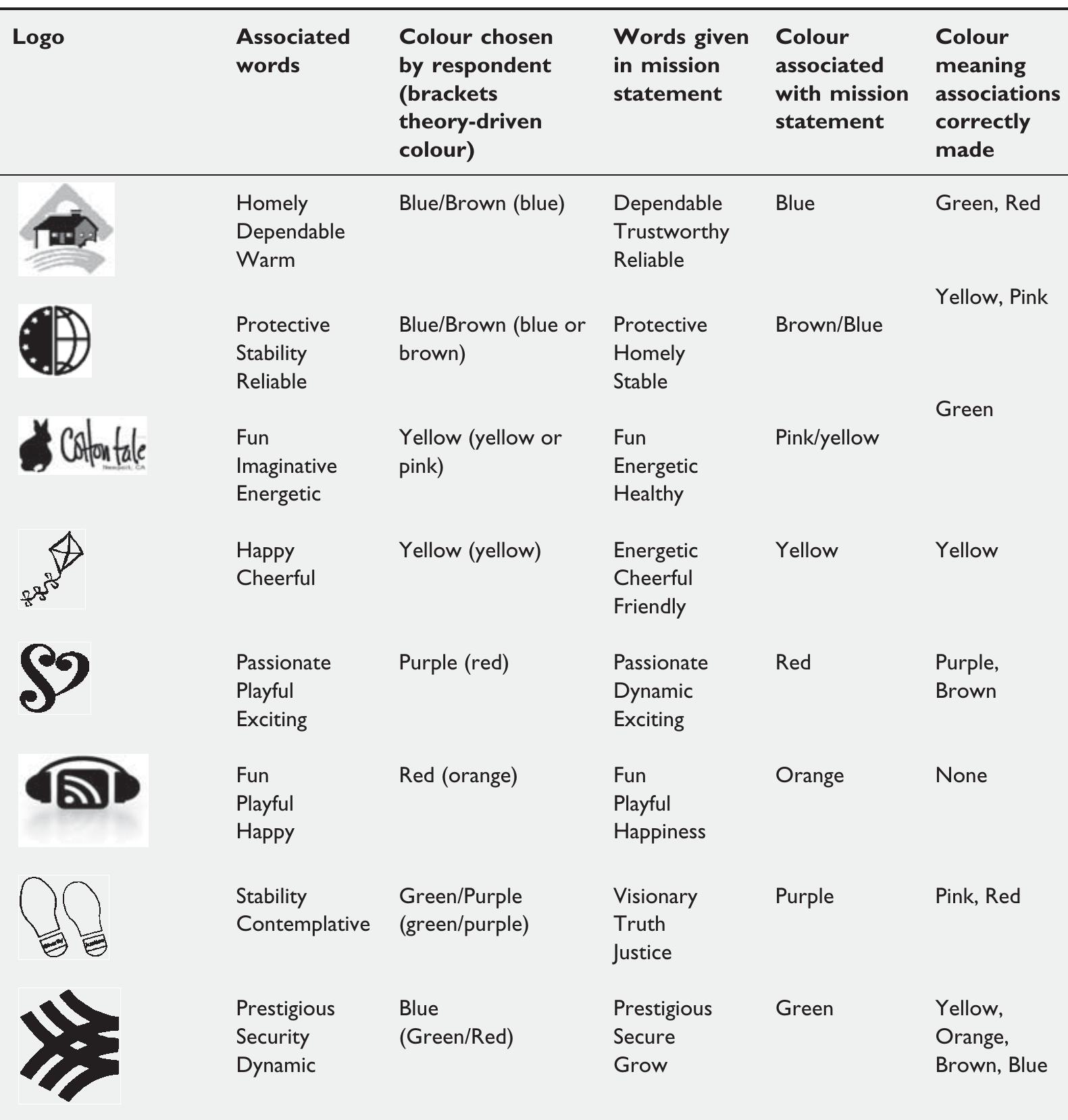
Colour is sometimes referred to as the ' silent salesperson ' as it exerts persuasive power at a subliminal level. 3 This idea can be easily illustrated: an image shown in vivid reds and oranges gives a completely different feel and meaning from the same image shown in pale blues and greens. This study therefore addresses the need to examine how people perceive the colour, design and meaning of logos to examine how these interlink to and affect the identity of the organisation, 4-6 a topic which to date has received little attention. 7 This study uses a two-stage experimental design to capture if consumers are able to match logo shapes to particular meanings (words) and secondly to determine whether respondents when presented with a logo and mission statement can identify a colour which best conveys this meaning. BACKGROUND The logo acts as a badge of identifi cation, 8 as a mark of quality 9 and as a way to

AI
Interdisciplinary journal of contemporary research in business, 2011
The objective of this research paper was to find out that what impact does logo of the company has on the consumer perception. How consumer perceive various logos with varying color, symbols and signs. Authors have used different logos and showed it to consumers. The questionnaire was developed and through stratified random sampling; it was administrated among sample population of 250. Regression analysis was used as statistical tool to analyze the relationship among dependent and independent variable. The findings showed that Consumer perception is significantly affected by logo of the company.
2019
845000_supplement for Let the Logo Do the Talking: The Influence of Logo Descriptiveness on Brand Equity by Jonathan Luffarelli, Mudra Mukesh and Ammara Mahmood in Journal of Marketing Research
1995
Logos (logotypes) are corporate emblems or symbols of identity that are designed to convey an organization's identity to its members and to outsiders. Current postmodernist influences, involving aesthetics of ambiguity and playfulness, have led to recognizable influences on the design of certain logos and may have influenced the public's impressions of the organizations that they represent. Design companies either do not carry out empirical impression-formation studies of logos or, if they do carry them out, do not generally publish their results. This study shows that the logos of six (tele)communications organizations create distinct impressions, and that these impressions are only sometimes of the type and quality presumably intended by their designers.
XIII CONFERENZA DEL COLORE Italy- Napoli, 2017
1-Introduction: Color considered one of the main aspects of visual communication. It has a remarkable impact on people's way to receive and interpret images. Color also has a functional role in attracting attention, conveying messages and evoking emotions. This explains why color is a significant element in brands visual identity. Color is a powerful communicative tool, and a memorable visual element that carries key symbolic and associative information and able to evoke certain emotions towards almost everything. It is the key element in grabbing viewer attention and has the power to motivate and persuade. Triedman and Cullen (2004) related brands with color associations in order to increase the confort level of the consumer. For example, red with green convey the idea of good Italian food. Dnews (2010) published that "Colors speak louder than words, time can be saved over the last 20 years, and clients' estimates of the time saved for them by the Color Affects system have averaged between 45% and 60%". A strong brand visual identity system depends on an attractive color to be visible and differentiated. It also consistently uses the same color in all its visual communications to be able to be recognizable, especially in increasingly competitive and saturated markets. Cultural associations, visual and psychological effects are very important considerations in choosing a color for a brand. But building a strong brand identity needs to widen our view and think about the common in different countries. It is important to understand the meanings of colors from one culture to another and how they differently interpret colors in the visual messages. A quick preview on global brands we can observe using almost the same colors, because they depend on the same references in choosing them. They aim to choose the appropriate colors that most of people will accept and understand globally. Avoiding risks and owing a suitable color are the reasons. Therefore, blue, reds are the most global brand colors all over the world. On the other hand, aiming to build a distinguished visual identity that could stand for the uniqueness and visibility needs to think differently when choosing a global brand color. This raises a question about how can we build a strong color identity for a global brand and what is more important for a global brand' color, appropriateness or uniqueness. Social media applications became a part of our daily life. They enable us to be connected to the whole world, and to be heard and seen, they also became the main source of our information. Mobile and tablet devices are now the main communicative channels for advertisers because they provide the ability to communicate on a personal level, so they are now perfect tool to achieve brand engagement. Choosing color for a brand needs to think carefully about the objective, personality and values the brand stands for. Brands aim to persuasion, trying to convey a certain message and communicate on a mental level; this objective needs to seek for color appropriate to be more credible. But Visibility and differentiation are very important to build strong brand equity as well and achieve satisfying degree of brand awareness. Ciotti (2016) on the contrary stated in his study "Impact of color on marketing," that color alone affects up to 90% of snap judgments made about products, another study conclude that brand personality is the main factor that affect color choice and therefore the color design depends on perceived appropriateness. In this context study, we are trying to develop a criteria in order to measure the degree of importance of both uniqueness and appropriateness in designing color identity for a global brand. Facebook, Twitter, Linkedin, Youtube, Instagram and Whatsapp are the applications were selected according to the results of surveys and studies proved that they are the most popular mobile applications in the years 2015/2016. The study aims to find an answer for the previous questions, through an analytical study of social media websites on mobile and tabs devices to explore what is more important for global brands when designing their color identity. 2-Background and Literature Review: Color is a light energy with different wavelengths, that influencing our perceptions. 4 primary colors (red, blue, yellow and green) were recognized, according to the way that color is processed in the eye and the brain. Subconsciously our eyes and bodies are continuously adapting to these wavelengths of light trying to reach the 1
“Logos and branding are so important. In a big part of the world, people cannot read French or English but are great in remembering signs” - Karl Lagarfeld Under the context of consumer marketing, brands play a significant and vital role as symbols. This paper examines the association of brands with symbols, and the function of brand symbolism in consumer marketing and how consumers tend to generate relationships with all brands thereby indulging in consumption. It also examines the importance of strategically positioning a brand image.
El diseño del logotipo es un importante elemento para la imagen de un producto o compañía, la percepción del consumidor se puede ver impactada al momento de apreciar sus diferentes características. El objetivo de esta investigación es analizar el efecto de algunos de sus elementos, tales como el color, la tipografía y forma en la percepción de la personalidad de la marca en diferentes categorías de productos. La metodología utilizada es la elaboración de estudios a través de experimentos, con diferentes estímulos para probar dicho impacto. Para el estudio de los datos se realizaron análisis de regresión, en los cuales se puede observar un efecto moderador de las características del logotipo en las diferentes dimensiones de la personalidad de la marca, teniendo la forma un efecto mayor. Estos resultados pueden tener como implicación práctica el uso de las características del logotipo como estrategia para fortalecer la personalidad de la marca deseada en las diferentes categorías. El estudio, cuya originalidad se presenta en la combinación de la personalidad de la marca con los elementos del diseño, está limitado en el número de categorías que se usaron para esta investigación. Palabras Clave: Logotipos; color; fuente; forma; personalidad de marca. Abstract Logo design is a very important element for the image of a product or company, what it communicates can have an impact on consumer's perception. The purpose of this research is to analyze the effect of some of its elements, such as color, font type, and shape on brand personality perception in different product categories. The methodology was the elaboration of experimental studies, with different stimuli to prove such impact. Regression analysis are used to obtain the expected results, where a moderator effect of the logotype characteristics can be observed in the different brand personality dimensions, finding that shape has a major effect. The implications of these results rely on the use of the logotype elements as strategy to strengthen the targeted brand personality in different product categories. The study differs from others by combining an analysis of these design elements with brand personality; it is limited to the categories that were used for this research.
Measuring Business Excellence, 2018
Purpose – This research aims to provide data and insights about the perception of commercial logos and to offer practical benchmark data useful to business organizations. Design/methodology/approach – The first study uses a pencil-and-paper survey to gather perceptual data about familiarity, subjective and objective visual complexity, aesthetic attraction, emotionality, number of colors and symbolic-social-status function of 142 brand logos. The second study uses a response time methodology to measure variables related to memory (i.e., cued recall and types of nonresponse). Findings – The paper offers insights into the relationship of relevant symbol-related variables. Emotional arousal correlates positively to aesthetic attraction and cued recall, and negatively to symbol knowledge. Emotional arousal and social reputation correlate weakly. Business organizations should be interested in knowing how users rate the emotions of their own and other organizations’ isotypes. Familiarity correlates negatively to response times, and positively to proper cued recall, aesthetic attraction and selfassessment manikin emotional scale. The subjective measure of complexity and the measures related to emotions correlate. Surprisingly, no correlation exists for the objective measure of complexity with emotion. The results could indicate that an unknown effect of mere exposure of complexity exists. The study found no correlation between visual complexity and variables related tomemory. Practical implications – Values of performance are needed to interpret business excellence. Data presented as supplementary file can be used for benchmark brand-logo relevant aspects. Also, the study suggests measuring the emotional value of logos, especially strength, as it is a predictor of recall. Moreover, companies with a socially reputed logo should try to create an emotional link to it. Repetition and likeness are two ways to improve emotional ratings. Therefore, the study suggests organizations to assure that their target likes their logo. As more complex logos are considered more attractive, the authors would recommend organizations to test logos with different degrees of complexity. Originality/value – This study is the first that offers normative logo data that can be used by practitioners as a benchmark of logo performance. Moreover, it promotes future research as it confirms and disconfirms previous findings and offers some new insight on brand research.
Journal of The Academy of Marketing Science
From beverages to consumer electronics, marketers are using color in innovative ways. Despite this, little academic research has investigated the role that color plays in marketing. This paper examines how color affects consumer perceptions through a series of four studies. The authors provide a framework and empirical evidence that draws on research in aesthetics, color psychology, and associative learning to map hues onto brand personality dimensions (Study 1), as well as examine the roles of saturation and value for amplifying brand personality traits (Study 2). The authors also demonstrate how marketers can strategically use color to alter brand personality and purchase intent (Study 3), and how color influences the likability and familiarity of a brand (Study 4). The results underscore the importance of recognizing the impact of color in forming consumer brand perceptions.
2017
Aalto-yliopisto, PL 11000, 00076 AALTO www.aalto.fi Taiteen kandidaatin opinnäytteen tiivistelmä Tekijä Riikka Iivanainen Työn nimi Branding through visual design: A case study of a company's visual identity guided by brand values and story Laitos Design Koulutusohjelma Design Vuosi 2017 Sivumäärä 57 Kieli English Tiivistelmä This thesis is a study on how a company can use visual design in branding. A company's visual identity has previously been studied mostly through corporate identity and from the perspective of designing individual identity elements. Visual design in all of its applications including products, environments and information has received less attention. The objective was to investigate what kind of considerations building and managing a visual identity requires and in which parts of branding visual design can play a role. Evaluating the effectiveness of the chosen approach to visual design was left outside the scope. The topic was studied through a literature review and case study. The Finnish distillery Kyrö Distillery Company was selected as the case company because of its active branding efforts and broad use of visual material. The case study was divided into visual research and interview with the company's marketing manager. The objective of the visual research was to gain an initial understanding of the case company's visual identity. The interview was conducted to shed light on the decision-making and challenges behind the visual identity. Since the study was a single case study of a company in the distinctive alcohol industry there are limitations to applying the findings to all businesses. In branding visual design can be used to differentiate products, create brand awareness and justify a premium price. The case study findings suggest that companies can approach creating a visual identity through their brand values and story. Companies should consider how different visual identity elements relate to each other as well as to the other senses. One of the biggest challenges is maintaining a coherent and consistent visual identity when collaborating with various other parties. Companies can benefit from clear instructions, a design manual and especially from centralizing visual design to one trusted design agency. This thesis provides a starting point for companies planning to create or redesign their visual identity as it highlights some of the main considerations and challenges when managing visual design. Visual design can be a powerful tool in branding and an alternative to traditional advertising.
AI
The research indicates that colour significantly enhances recognition and recall, with specific hues linked to emotional responses, such as red stimulating appetite and excitement.
Representative logos are more likely to have matched meanings with chosen colours, showing that design type correlates with consumer associations and brand identity.
An exploratory two-stage experimental method was employed, where participants selected words for black-and-white logos before choosing suitable colours from eight options.
While some cultural nuances exist, the study finds more commonalities in colour meaning across cultures, suggesting overarching psychological responses to certain hues.
Choosing a colour that contradicts a company's image can create confusion, requiring additional efforts to reinforce the corporate identity among consumers.
Naše gospodarstvo/Our Economy, 2021
The purpose of the present study was to test whether logo shape and color affect emotional and cognitive response to a new logo. In the explorative part of the study, the effect of the amount of each of the additive primary color on logo perception was examined. Research was done on a sample of 190 students whose ratings were used as logo description measures. Two independent variables used in the study were logo shape (abstract vs. concrete) and logo color (original color vs. greyscale). Results showed that greyscale logos and logos that are concrete were recognized more accurately while liking was not related to either independent variable. It was also observed that the amount of red color in logo is negatively (correlated/related), and blue and green color are positively related to both logo recognition and logo liking. Practitioners are advised to note that factors affecting consumers' cognition and emotion are different. Scientists can extend findings on the effect of amount of individual colors in a logo. This is one of the first works of research that examined the effect of logo color on brand recognition and has approached studying color in this way of averaging amount of each of the additive primary colors. External validity of the research is enhanced by testing the younger generation in their natural habitat of mobile phone environment.
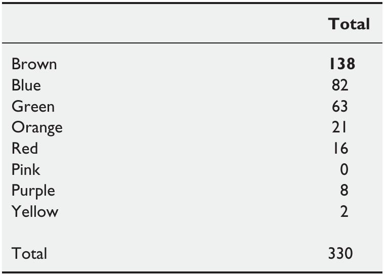
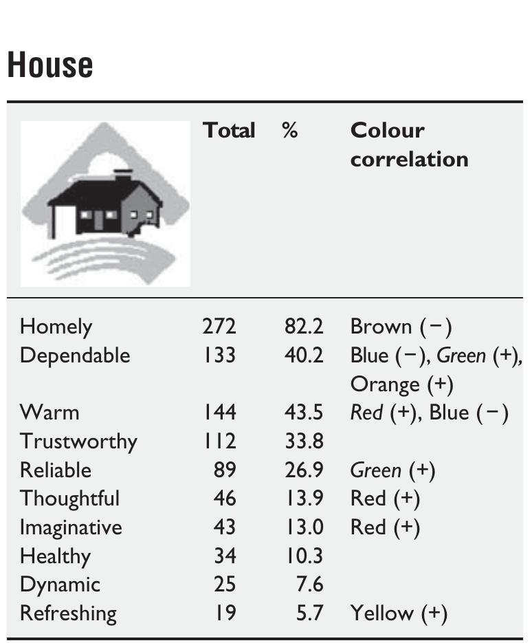
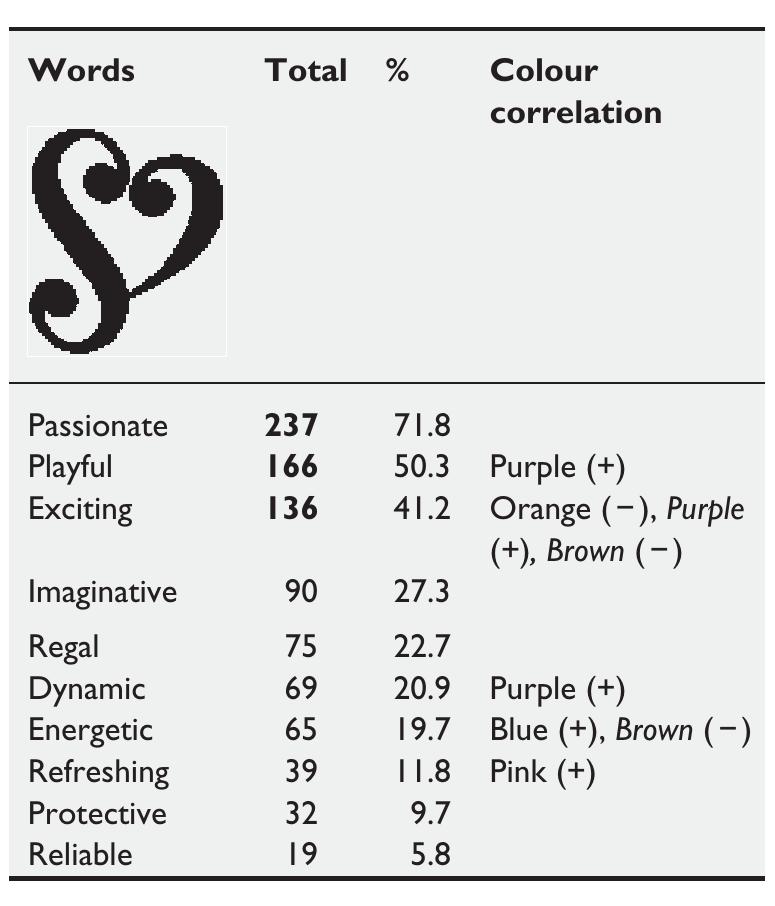
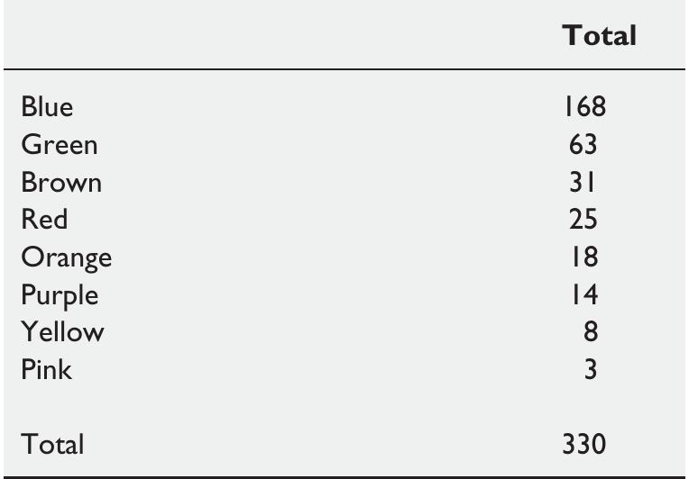
Hynes's research (the main basic concept): This study examines the triadic relationship between colour, design and the evoked meanings of logos to understand how these contribute to building a consistent corporate image. Results strongly indicate that consumers make clear judgements about the image of a firm from the logo design and have strong opinions about which colours are appropriate for different corporate images. This study therefore addresses the need to examine how people perceive the colour, design and meaning of logos to examine how these interlink to and affect the identity of the organisation, a topic which to date has received little attention. The summary of the research is presented on Figure 1: Hynes's research limitations and further development summary: This study has limitations including the sample size (total 330 respondents (1 st wave from the street in Scotland), second wave – online), the range of colour choices (8 colours) and omission of black and white as colour choices. Future studies could ask respondents to select from a wider range of colours including tones and shades of the main colours, or include in-depth qualitative work. The suggested dissertation topic will intend to investigate a colour meaning in corporate logos with a focus on the luxury market among Millennials (the future luxury customers). In the proposed research topic will be used more logo combinations (13 colours) and this research will investigate more in-depth the colour meaning in particular the luxury logos for Millennials.
Colour is ubiquitous and is a source of information. The earlier researchers argued that the prudent use of colours can contribute not only to differentiating products from competitors, but also to influencing moods and feelings and therefore, to attitude towards certain products. The interactive effects of colours show that the relationship between brands and colour hinges on the perceived appropriateness of the colour being used for the particular brand. There have been numerous attempts to classify consumer responses to different individual colours, but the truth of the matter is that colour is much dependent on personal experiences to be universally translated to specific feelings. The previous works of researchers have revealed that our brains prefer recognizable brands, which makes colour incredibly important when creating a brand identity. It has suggested researchers that it is paramount importance for new brands to specifically target logo colours that ensure differentiation from entrenched competitors. So, it is important that the managers understand the importance of colours in marketing and use it appropriately in advertising, packaging, and designing company's logo. With this backdrop, this research work was designed to find out the impact of colour on consumer brand perception. The outcome of this study reveals that the white, red, black and brown colour has impact on sincerity, excitement, sophistication, and ruggedness respectivelyof the brand.
Aristotle, a famous Greek philosopher, indicated that all perceptions are triggered by witness. Consumers have a first impression of sight memory for products within 0.67 seconds. The first impression dominates 67% of the purchasing process, which comes from colors. This research considers using colors to manifest corporate brand image and charm and believes that inappropriate usage of colors may confuse the corporate brand memory and image. This paper utilizes Birren's Color Theory to identify each color trait and explore the consistency between color traits of the corporate brand and the vision and goal of corporate identity. The results reveal that color also guides consumers to recognize corporate brands and, corporate brand recognition and image improves purchase and profit.
Journal of Marketing Research
Logos frequently include textual and/or visual design elements that are descriptive of the type of product/service that brands market. However, knowledge about how and when logo descriptiveness can influence brand equity is limited. Using a multimethod research approach across six studies, the authors demonstrate that more (vs. less) descriptive logos can positively influence brand evaluations, purchase intentions, and brand performance. They also demonstrate that these effects occur because more (vs. less) descriptive logos are easier to process and thus elicit stronger impressions of authenticity, which consumers value. Furthermore, two important moderators are identified: the positive effects of logo descriptiveness are considerably attenuated for brands that are familiar (vs. unfamiliar) to consumers and reversed (i.e., negative) for brands that market a type of product/service linked with negatively (vs. positively) valenced associations in consumers’ minds. Finally, an analysi...
Colour: Design & Creativity , 2007
A sign is said to be transparent when we pay direct attention to its meaning, while the sign itself, as a medium to the meaning, passes unnoticed. It is the ordinary function of words of language. What is important in this context is the meaning of the word, more than the ...
1st International Brand Design Conference, 2018
Psychology & Marketing, 2014
Most brands are represented visually in print advertisements, and these visual representations must consistently identify the brand to the consumers who encounter it. At the same time, some of the particular visual elements used to represent the brand must change over time, because it is not acceptable to run the same ad year after year without refreshing its visual content. To explore these issues, a qualitative exploration was conducted with ad agency art directors and ordinary consumers. The focus was the criteria used by each group to determine when changes in the visual representation of the brand succeed, by staying consistent with the brand's identity, or fail, by violating expectations. Professionals, with their greater aesthetic sensitivity, had a more narrow latitude of acceptance for changes. A follow-up experiment with consumers showed that aesthetically aware consumers were likewise more sensitive to alterations in visual brand identity than consumers for whom aesthetics were not central. Results are interpreted in terms of assimilation effects and degree of incongruity along with the moderating effect of aesthetic skill. C 2014 Wiley Periodicals, Inc.
ACR North American Advances, 2017
It is tempting to follow a well worn path and draw up a simple formula that makes apparently natural connections between colour, geography and identity, especially in Australia. Such a formula is fashioned from a series of analogies that act as boosters for specific mythologies about Australia as a country, nation, culture or even design industry. Following the tourist public relations brochures, and the colours of Australian national sporting teams, you could wax lyrically about the golden yellow of the Wattle flowers or that dark bottle green that is symbolic of what?—Eucalyptus trees maybe. Note here the attribution of names for interior design colours found in charts for various paint companies. (see Fig. 1) An analysis of the history of colour chart nomenclature provides a fertile ground for reading a culture through the different names for colours. The names such as Drover's Swag, Walkabout, or Billabong's Edge, given to the paint samples in the Wattyl colour system,...
Journal of Product & Brand Management, 2012
It is critical to investigate reactions to the various name and logo redeployment alternatives available in the context of a brand merger. Yet research on this topic is relatively limited. This paper aims to start filling this gap in the literature, by developing a typology of the visual identity structures that may be assumed in the context of a merger, as well as an exploratory study (n = 467) analysing consumers' preferences regarding the alternative branding strategies. It uses an innovative design, which gives respondents freedom to choose their preferred solution. Results suggest that there is a clear preference for figurative logos. Furthermore, there is evidence that the logo may play a role as important as the name in a merger, ensuring consumers that there will be a connection with the brand's past. Data also show that the choice of the logo reflects consumers' aesthetic responses, whereas the choice of the name reflects consumers' evaluation of the brand's offer or off the brand's presence in the market. These results should guide managers in the evaluation and choice of the postmerger branding strategy.
International Studies of Management & Organization
Full bibliographic details must be given when referring to, or quoting from full items including the author's name, the title of the work, publication details where relevant (place, publisher, date), pagination, and for theses or dissertations the awarding institution, the degree type awarded, and the date of the award.
Journal of Product & Brand Management, 2015
Purpose – This paper aims to study how logo design characteristics influence consumer response. Based on an in-depth literature review on consumer responses to logo design, the authors included in this research one fundamental dimension of logo design, namely, naturalness and investigated the influence of the different types of natural logo designs on affective response. Design/methodology/approach – In total, 96 logos were selected as design stimuli. The logos were previously classified, according to the naturalness of the logo design, as having an abstract, cultural or organic design. Responses were gathered through a survey in Portugal, including two studies with 220 participants. Findings – Results show that naturalness is an essential logo design element which significantly influences consumer affective responses to the logo, and that natural logos are clearly preferred to abstract logos. Additionally, this research indicates that, within natural logos, organic designs are favo...
Qualitative Market Research: An International Journal, 2017
Purpose This paper aims to examine the impact of corporate logos on corporate image and reputation in creating competitive advantage in the context of Persia and Mexico as emerging markets. The paper provides an extensive links between corporate logo and its dimension and internal stakeholders’ attitudes towards advertisement, familiarity and recognisability as intermediaries to corporate image and reputation. Design/methodology/approach A qualitative exploratory approach was undertaken, comprising 12 face-to-face interviews and 14 skype in-depth interviews with graphic designers, design, communication and marketing consultant in Mexico and Persia based on attribution theory. Findings The study posits that the more favorable the name, colour, typeface and design of the company logo, the more favorable the attitude Mexican consumers have towards the corporate logo, corporate image and reputation. However, in comparison for Persia these factors have less effect on customers’ judgment ...
Journal of Business Research, 2020
Full bibliographic details must be given when referring to, or quoting from full items including the author's name, the title of the work, publication details where relevant (place, publisher, date), pagination, and for theses or dissertations the awarding institution, the degree type awarded, and the date of the award. If you believe that any material held in the repository infringes copyright law, please contact the
Journal of Brand Management, 2020
A strong brand identity must comprise unique identity elements such as logos, colours or characters that distinguish it from competitors and facilitate recognition and purchase. A critical marketing function is therefore deciding which elements to invest in, to protect and build this identity. Within this paper, a new measure, Competitive Intensity, is proposed as a means to critically evaluate brand identity elements on their uniqueness potential. Results of testing 1281 in-market elements from 13 consumer packaged goods categories in 19 countries show that character, logo and logotypes have the greatest potential for unique brand ownership. Colour, however, is more challenging to develop as a unique brand identifier due to high levels of competitive sharing. Competitive intensity varies for elements of the same type, suggesting that practitioner execution plays a critical role in successful ownership. Being the first empirical comparison of eight element types, this paper provides comprehensive guidance to practitioner decision-making.
Núcleo do Conhecimento, 2021
Le proprietà fisico-chimiche e sensoriali sono elementi di cui tenere conto durante lo sviluppo dei cosmetici. Le creme idratanti rappresentano una delle classi più importanti di prodotti per la cura personale e spesso appaiono in una vasta gamma di diverse opzioni di colore. Questo studio mirava a sviluppare una crema idratante sotto forma di gel-crema ed esplorare le opzioni dei colori metallizzati attraverso l'analisi sensoriale. In base ai risultati ottenuti, è stato osservato che il tipo di pigmento ha influenzato la percezione dei giudici, dimostrando che l'influenza di questo componente non deve essere trascurata nel posticipo di nuove formulazioni. È possibile dedurre che la reazione di un consumatore a un cosmetico non si Influenza del colore sulle proprietà fisico-chimiche e sensoriali dei cosmetici idratanti www.nucleodoconhecimento.com.br
Núcleo do Conhecimento, 2021
The physical-chemical and sensory properties are elements to be taken into account during the development of cosmetics. Moisturizers represent one of the most important classes of personal care products and often appear in a wide range of different color options. This study aimed to develop a moisturizer in the form of gel-cream and explore the options of metallized colors through sensory analysis. According to the results obtained, it was possible to observe that the type of pigment affected the judges' perception showing that the influence of this component should not be disregarded in the postponement of new formulations. It is possible to infer that a consumer's reaction to a cosmetic is not only based on its effectiveness, but Influence of color on the physicochemical and sensory properties of moisturizing cosmetics www.nucleodoconhecimento.com.br also on the way in which its physical characteristics are perceived, including color, appearance, skin sensation and smell.
